JetBlue Pattern rebrand
Spotlight
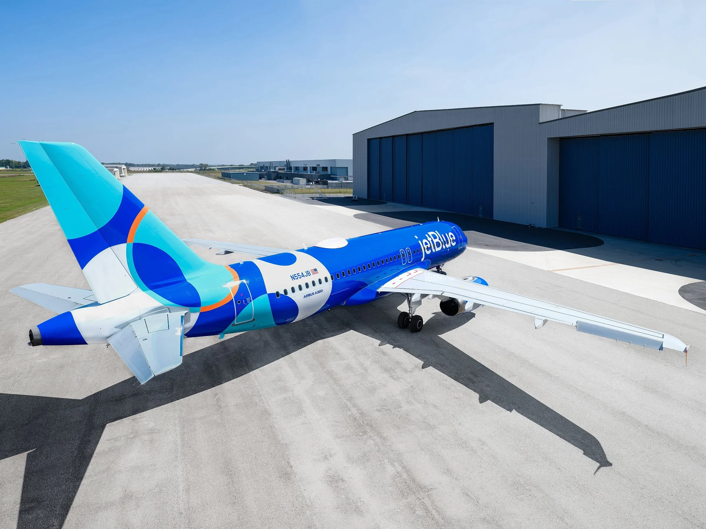
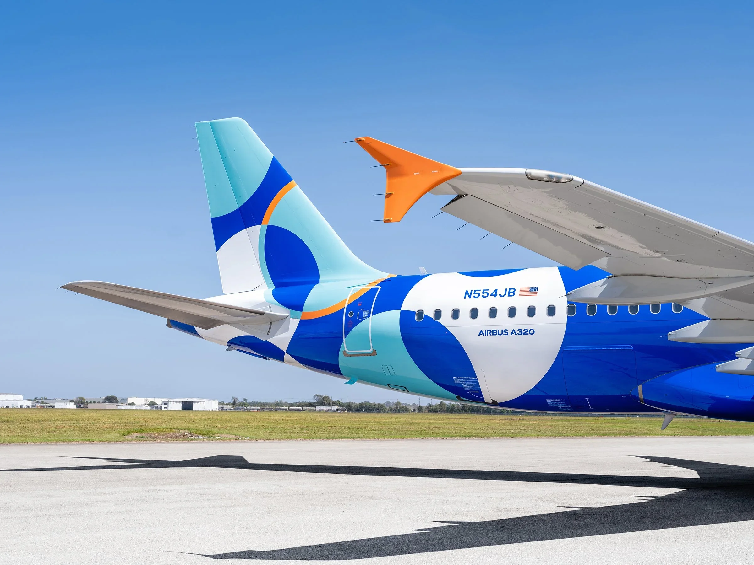
As part of JetBlue’s refreshed brand identity, Spotlight was developed as a bold pattern system designed to bring energy, movement, and visibility to the airline’s visual language. Defined by vibrant color and eye-catching overlapping circles, the pattern reflects JetBlue’s focus on optimism, connection, and modern travel. Serving as a flexible graphic element that could live seamlessly across digital, environmental, and experiential applications.
As Design Lead, I guided the evolution of Spotlight from concept through execution, ensuring the pattern extended the core identity while remaining adaptable at scale. I oversaw its application across multiple touchpoints, refining color, rhythm, and composition to maintain clarity and impact in motion, print, and large-format environments. The result was a distinctive, recognizable pattern that amplified JetBlue’s refreshed brand while adding depth, personality, and visual momentum to the overall system.
Credits
Project Lead – Cameron Trautman
Brand Strategy – Prophet Consulting
Photography – Laird Kay
Role
Designer